22 October 2008
Tax
From Democratic Underground, a chart comparing the candidate's tax plans. Shown below:
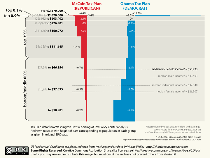
In contrast to the WaPo version, this one shows each bracket in correct proportion to the whole. Obama's marked increase of taxes is now a small sliver of the graph; McCain's marked decrease equally so. As are the converse. This all could be considered part of what Arianna Huffington calls the death of Rovian politics. Something I'd hoped would come sooner (yes, still bitter about the mass stupidity that put Bush into office twice) may have finally arrived: accessible knowledge for all is squelching the free flow of willful ignorance. No question that it's still occuring, but maybe the YouTube videos and more mainstream blogs have created a greater circulation (and greater vetting) of infomation that was four and eight years ago relegated to personal blogs alone.
Anyone can make a graph. With blogs, anyone can publish it. With fact checkers publishing to millions, that graph will finally get out to millions. You may not be swayed one way or the other by the contents of it, but at least you're now getting a more accurate representation of the facts.
[ updated 30 Oct 2008 ]
Lisa found a tax consultant's comparison of the McCain and Obama tax plans.
- It's not him, it's us posted by sstrader on 5 May 2016 at 9:26:33 PM
- More political transcriptions posted by sstrader on 20 March 2016 at 10:19:06 AM
- Health cost posted by sstrader on 18 September 2015 at 10:39:05 AM
- Assassination dept. posted by sstrader on 18 December 2013 at 11:58:24 PM
- Repeat posted by sstrader on 6 September 2013 at 8:19:58 PM